I went with this sketch but decided to tweak it so that her hair would be flowing in the wind:

So I set to work on sketching in Photoshop and Paint Tool Sai (a Japanese program similar to Photoshop that can process .psd files) ((the only real difference is that Sai has line stabilisation for my Wacom tablet pen))
First I set my guides for the spine and flaps:

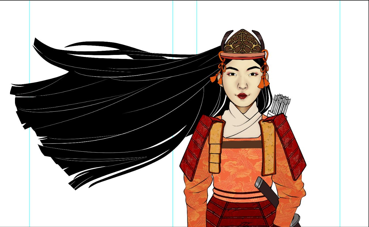
Then I began sketching her hair and testing the double exposure look with it:


Then I sketched a face and began shading:


Using this woman dressed as Tomoe as a reference for the armour, as well as depictions of samurai and Japanese women from the Kamakura period (1100s and early 1200s):


I began sketching her armour and colour coded the sketch to differentiate between each layer:

After working on the line art I applied patterns to each component of the armour using the Transform tool (distort/perspective):

I had planned to make the woodblock action scene that would be double exposed in her hair myself and did a whole watercolour action scene:


I added grain as a Soft Light layer over it.
However I didn't like the little amount of detail and action when I set is as her hair. So I hope to come back to that.
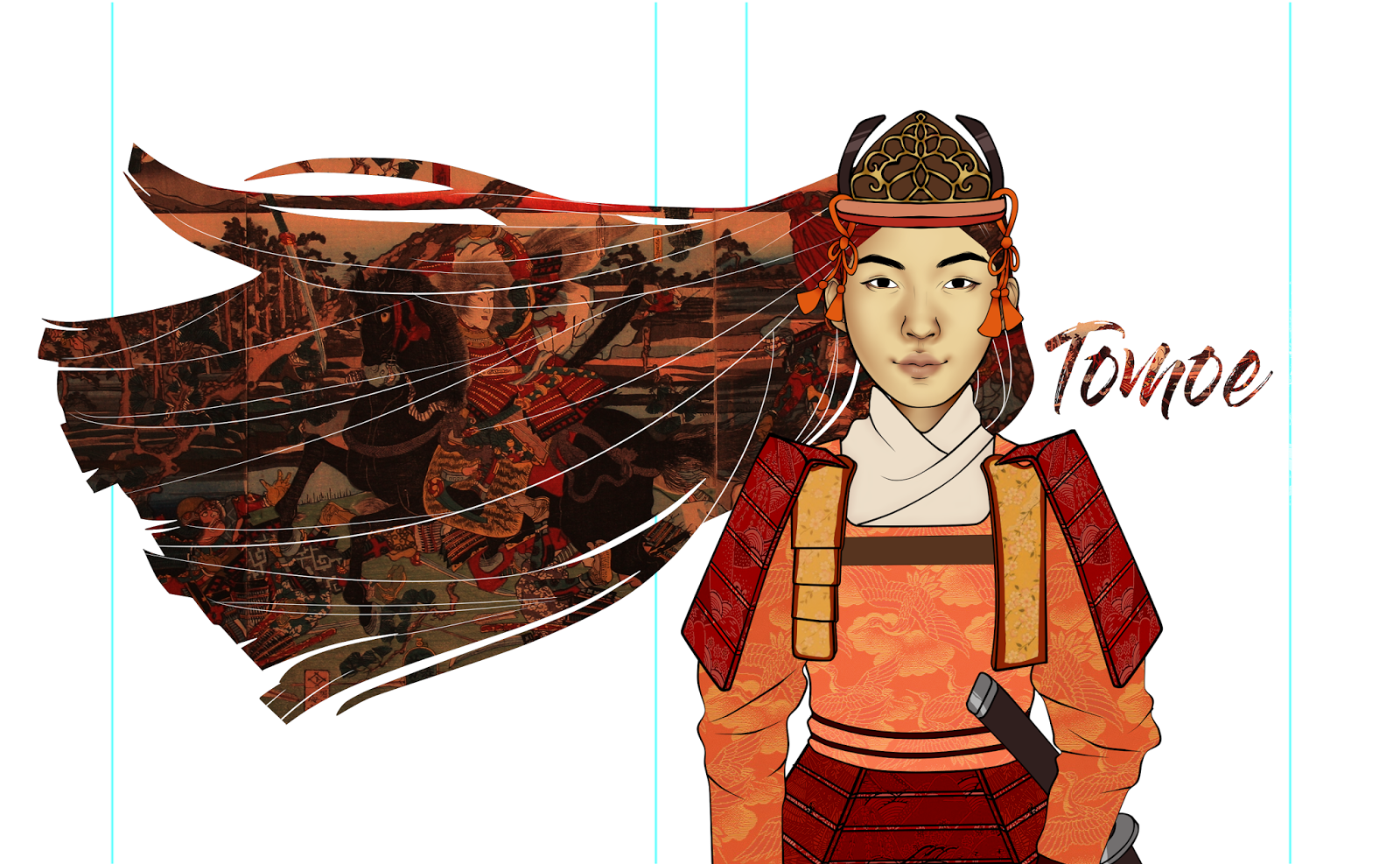
As for now I used an actual woodblock print depicting Tomoe. My Photoshop on the laptop I was using wasn't completely functional with the Text tool so I haven't been able to put in my text yet ): Here are my options so far (I'm having trouble parting with the plain black hair!!!) With options for her plain-faced and with the traditional white powder and red lipstick of the time:


Tell me what you think!
Arriving in class to a computer with Photoshop that can do fonts I set to work on my fonts:


(Fonts from daft.com: Dry Brush and Gloss and Bloom)
I decided to do a double exposure here too:

I tried the watercolour background I painted:

As a very transparent background for the whole thing, and pumped up the opacity on the flaps for a pop of colour when the book is opened:

And here is an idea of what t might look like on a book (done in Photoshop):


I really like this so far! Any feedback?


No comments:
Post a Comment